Response Ready: Visual identityFirst aid, without the usual blue.
In a crowded first aid and medical training market, Response Ready needed to stand apart from the familiar blues and greens of the industry. I created a bold identity, built around a custom icon, that still signals care and safety at a glance but looks like no one else on the road.
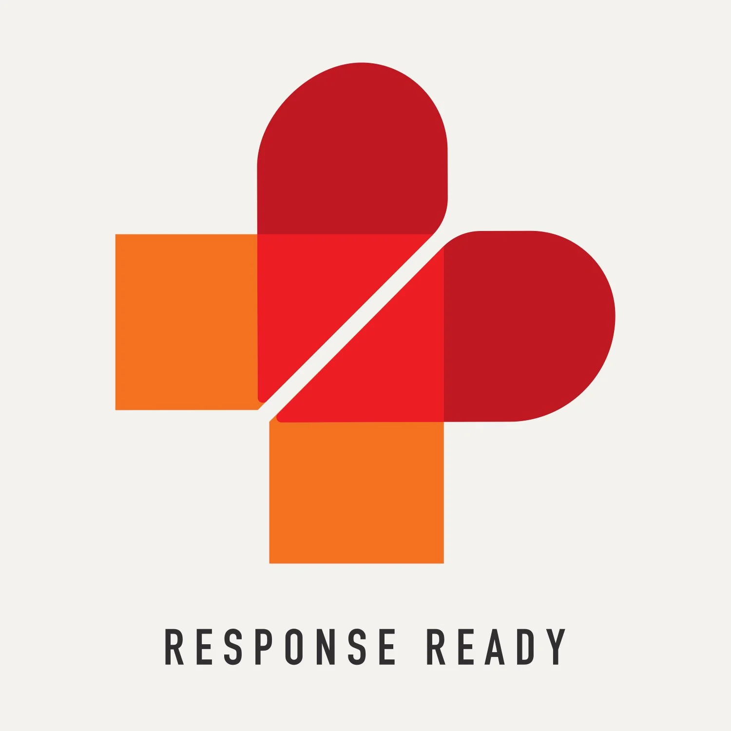
Response Ready logo and icon
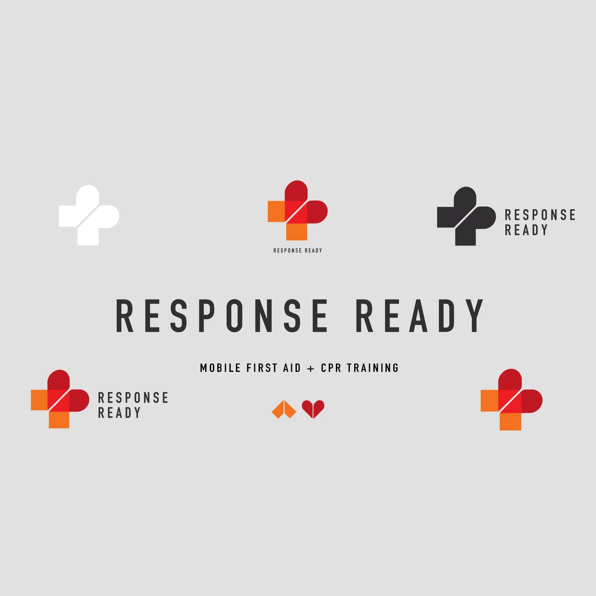
Logo suite
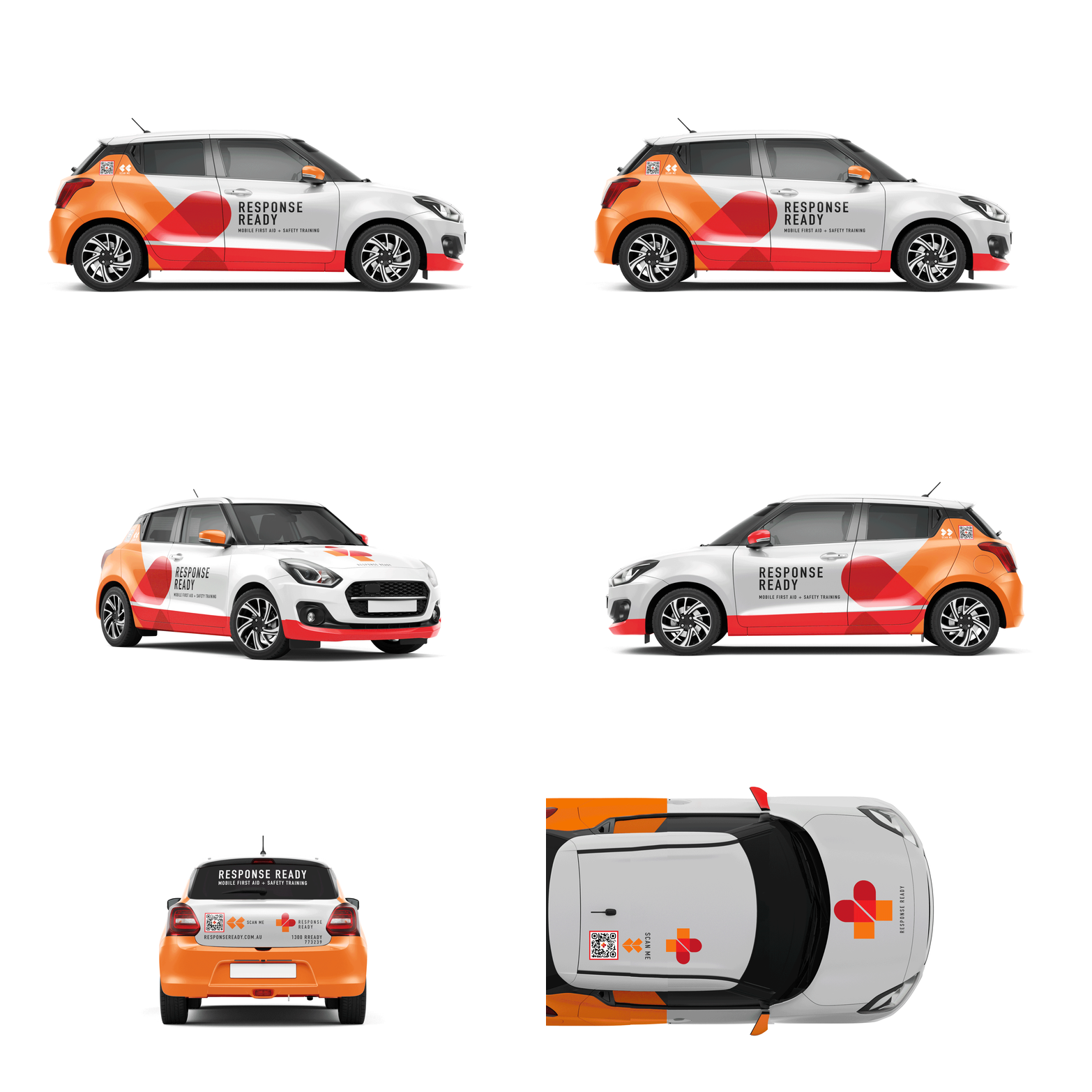
Vehicle graphics
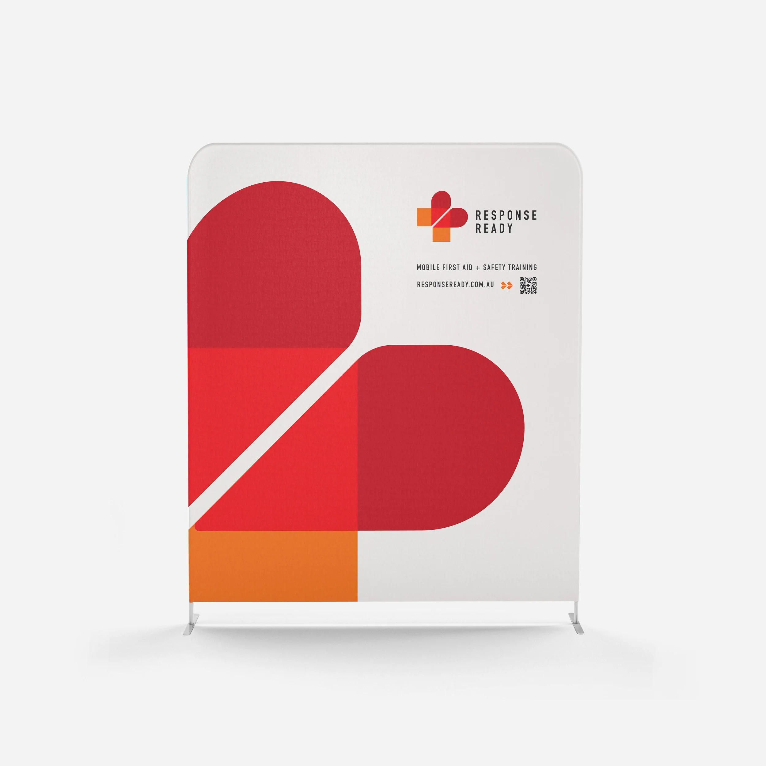
Trade banner
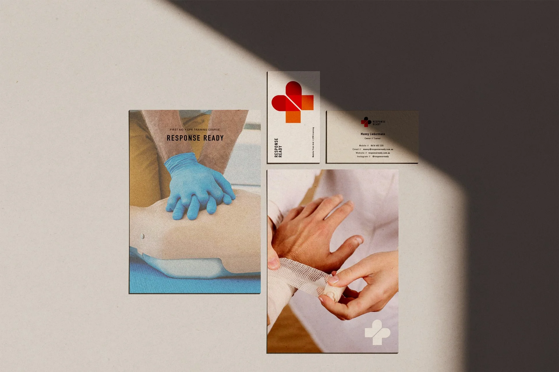
Branded stationary
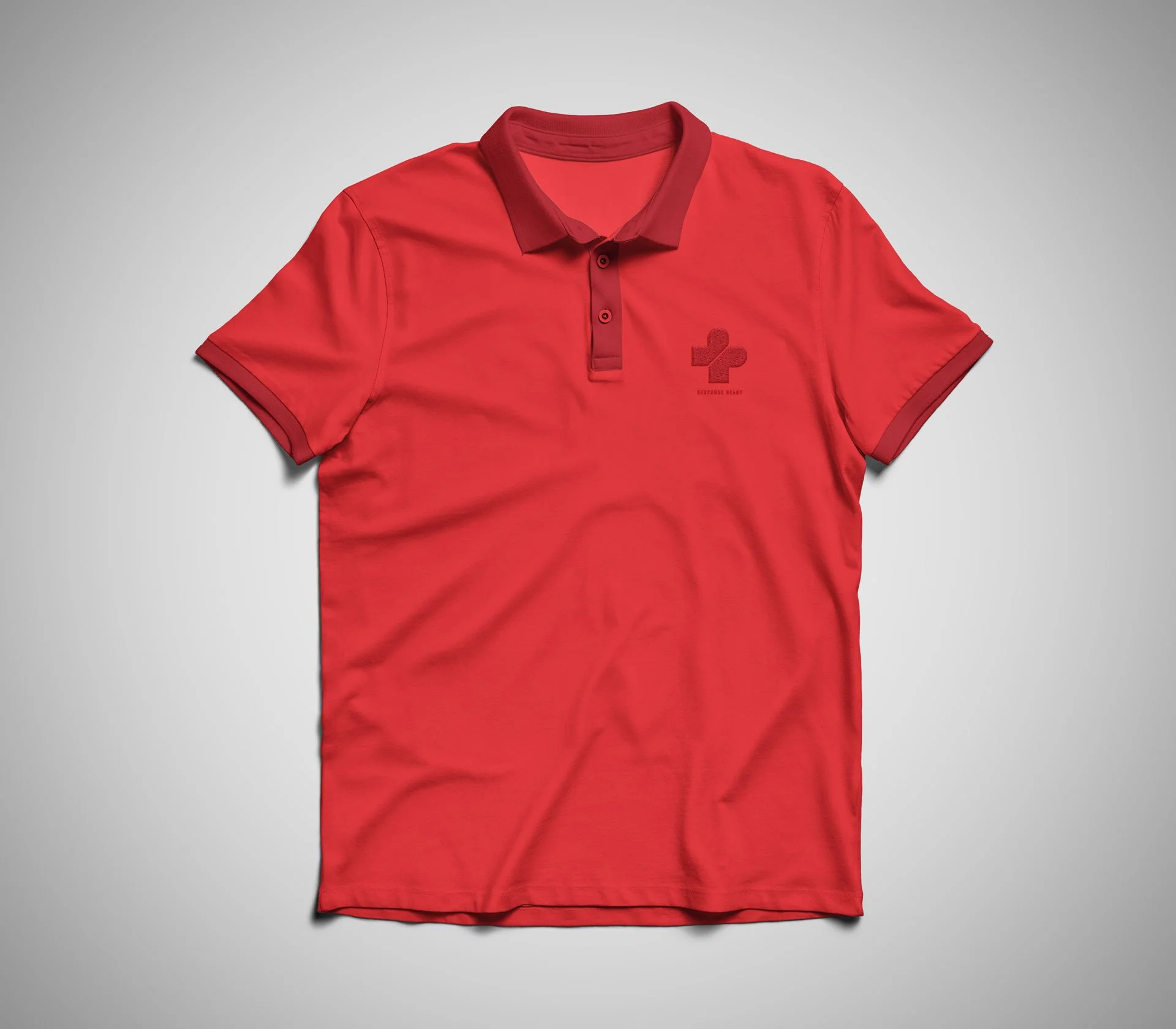
uniform
The details
The challenge
First aid training brands tend to look the same: clinical blues, safe greens and the expected cross. Response Ready needed to be recognised instantly, trusted straight away, and remembered long after the course was over.
The idea
I built the palette from red and orange: warm, urgent and confident. The colours keep a clear link to emergency and medical care without leaning on the sector’s usual palette. At the centre is a custom icon that brings together meaningful elements from the owner’s vision. The result is a graphic device that’s simple, energetic and unmistakably theirs.
Building the system
The icon was designed to work at every scale, from a business card to a full vehicle wrap. Strong colour and clean type carry the identity across stationery, uniforms and large-format vehicle graphics, so whether it’s a certificate or a car in a car park, it’s always clearly Response Ready.
My role
Visual identity · Custom icon · Colour palette · Typography · Stationery · Vehicle graphics