Cut Snake Distillery: Branding and label designA new spirit, drawn from the cane fields.
Cut Snake Distillery was new to the liquor world and needed a brand that would be taken seriously from day one. Working with Tegan of One Page Studio, I helped define the distillery’s look and feel. Then, for its first release, I created the label concept and hand-drew the illustration at its heart: a man burning the cane fields of northern New South Wales.
Cut Snake Distillery logo
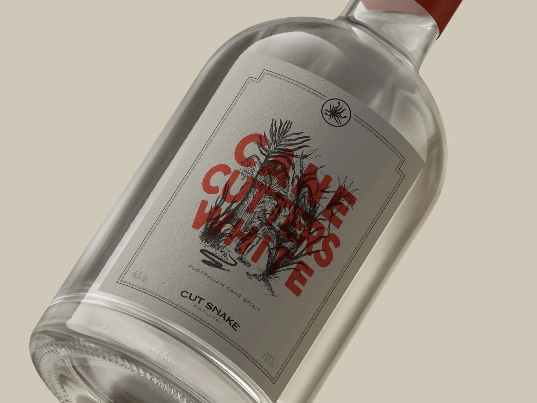
Cane Cutters White: bottle
Logo suite
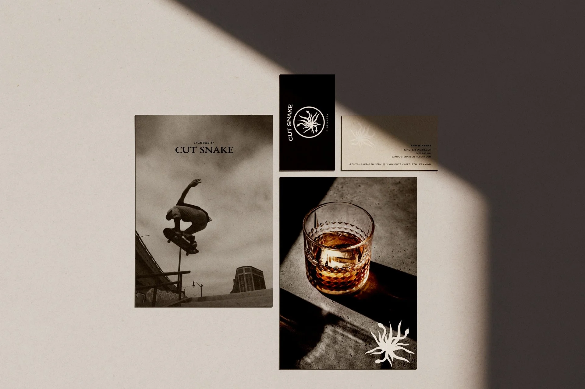
Stationery and brand imagery
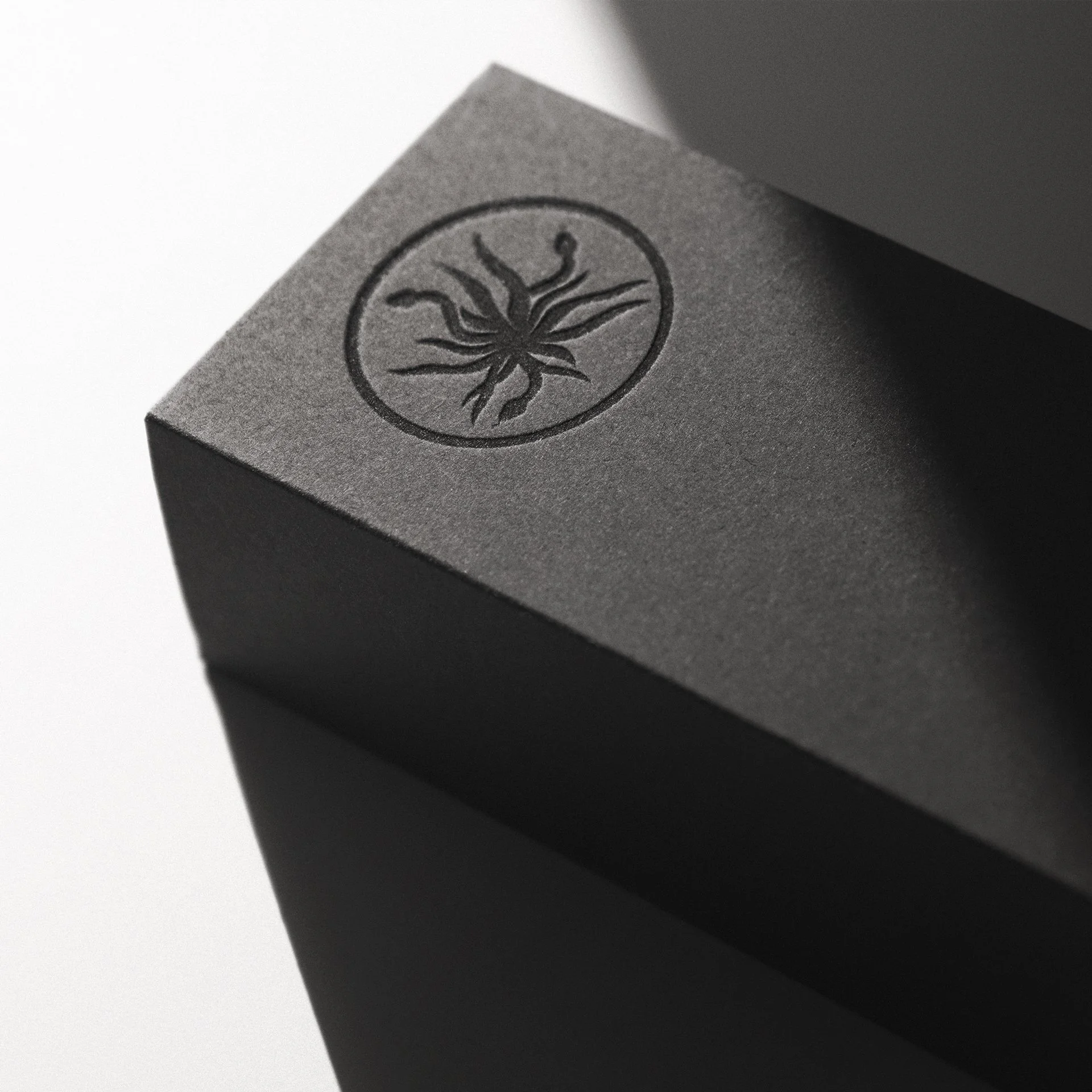
Embossed gift box
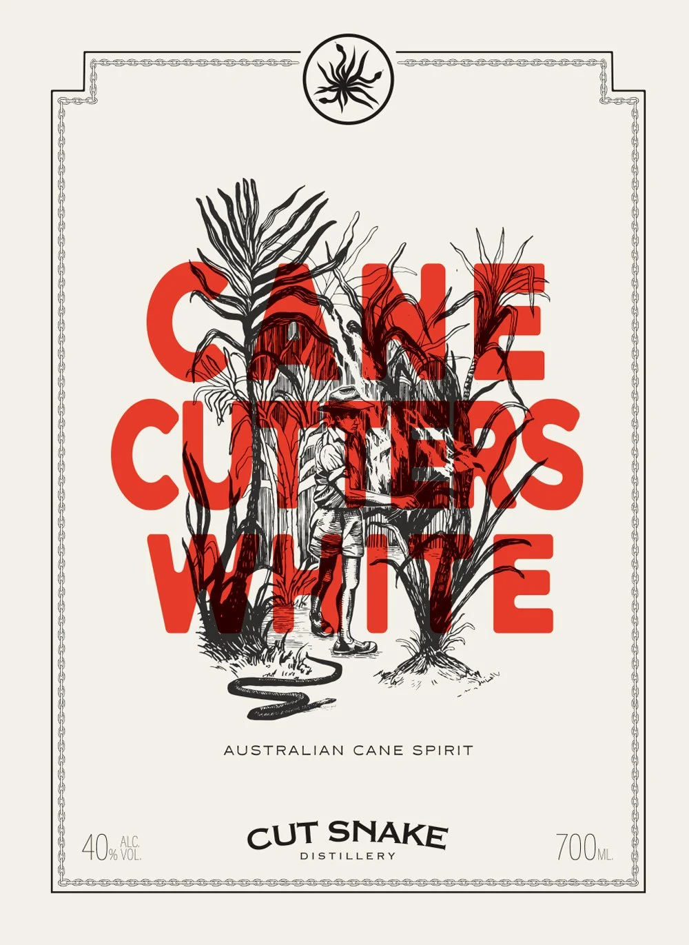
Cane Cutters White: front label
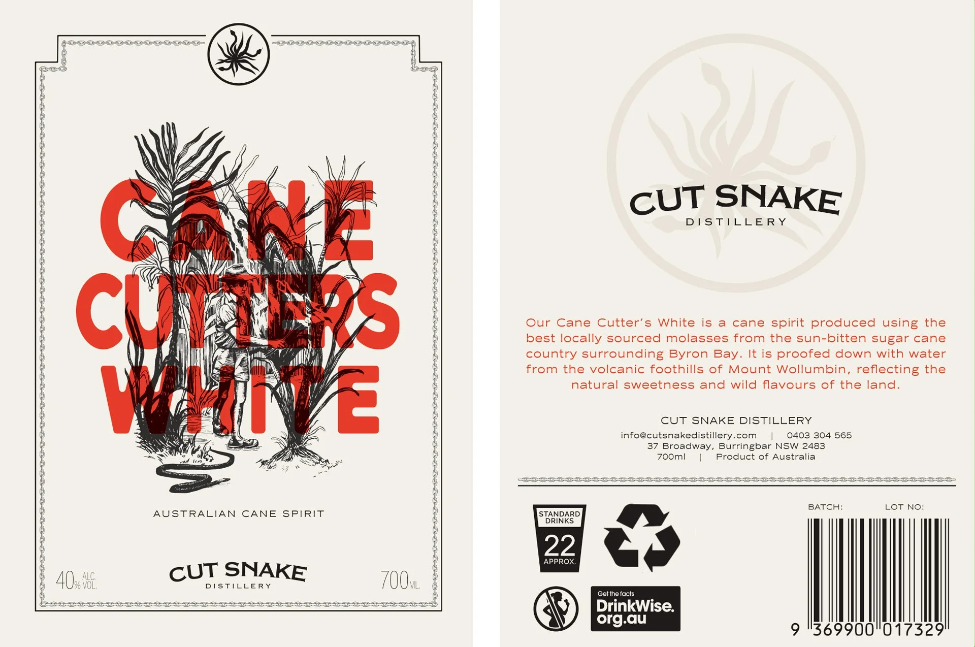
Front and back labels
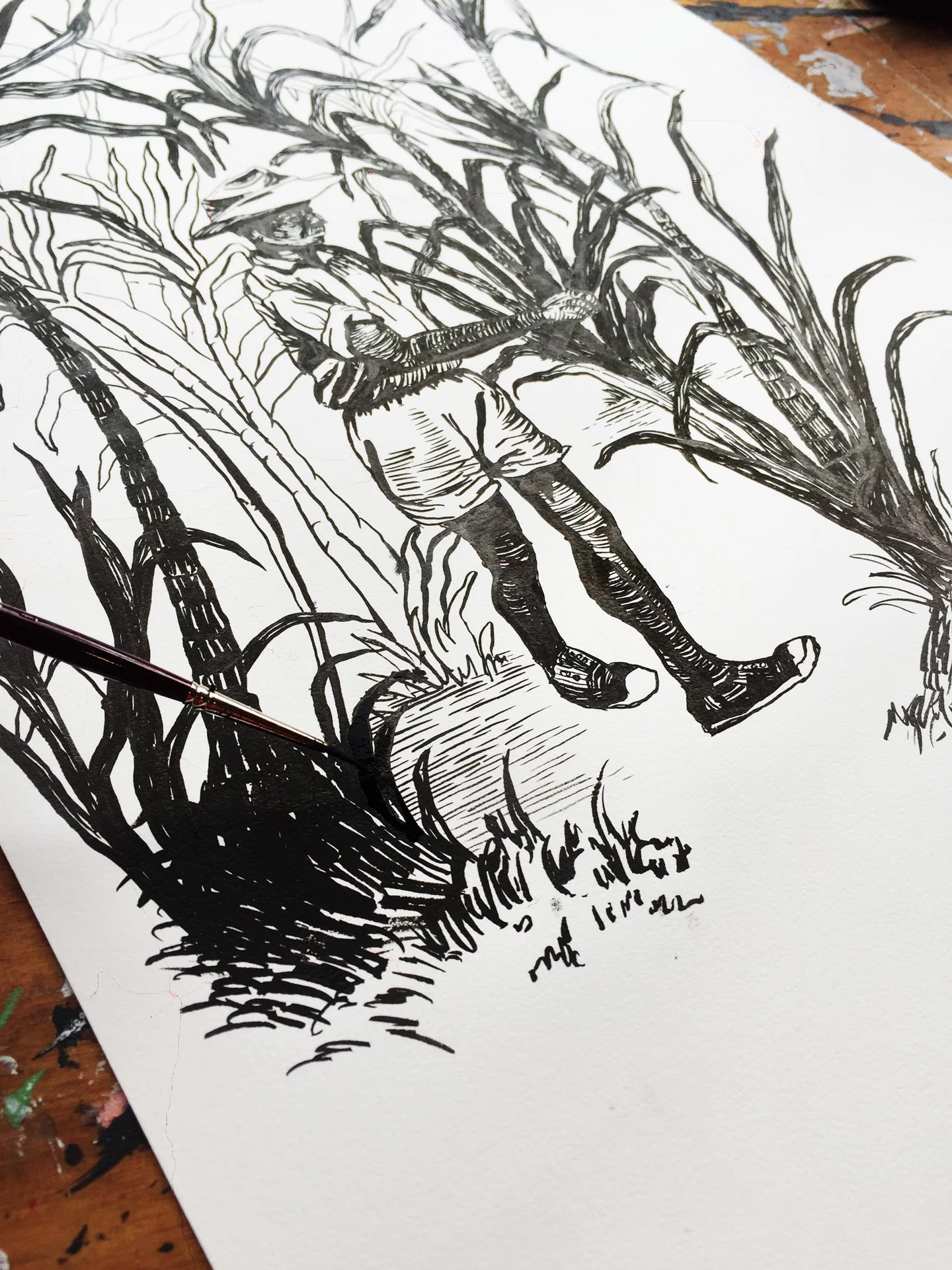
The illustration in progress: ink on paper
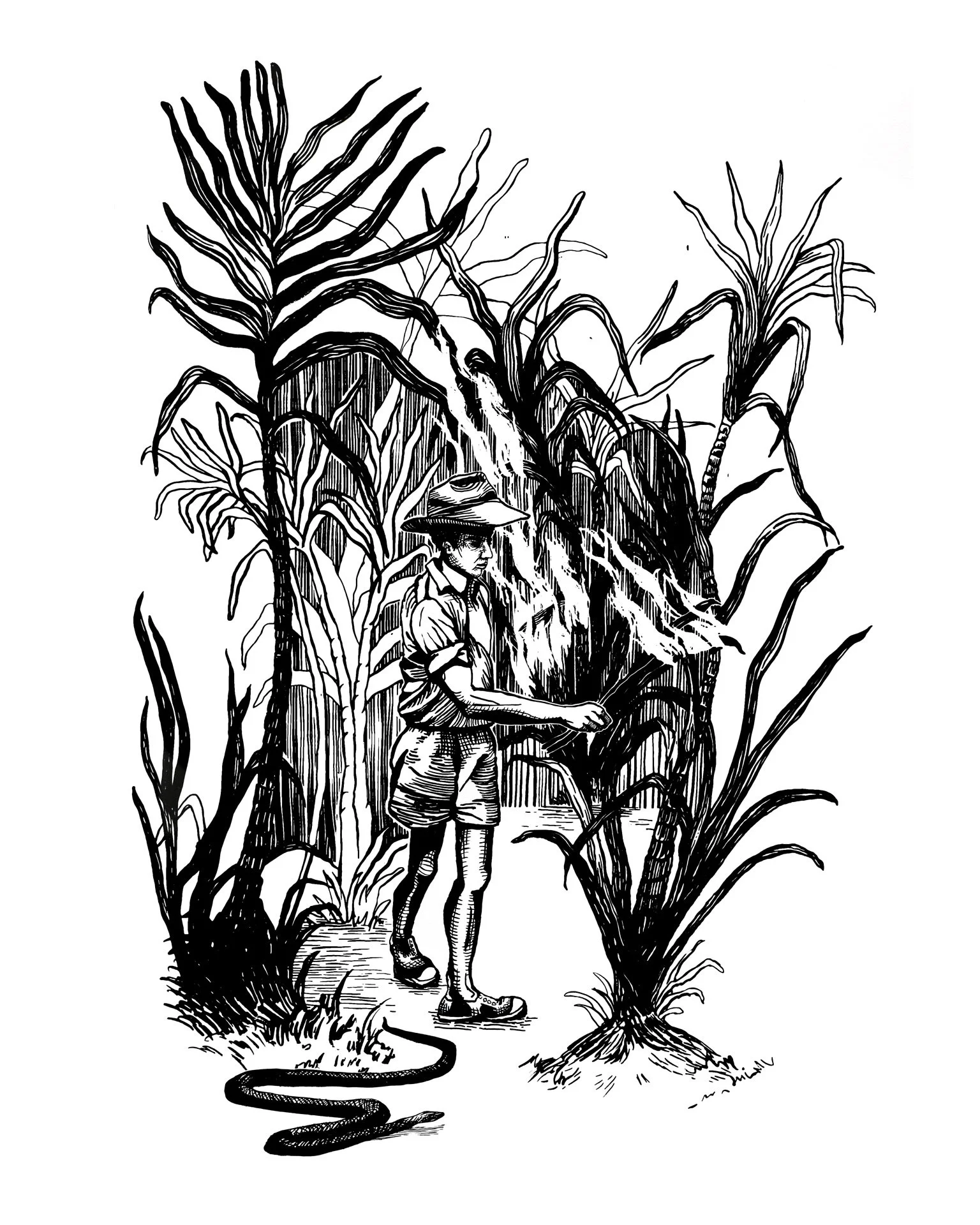
Final illustration: burning the cane fields
The details
The challenge
As newcomers, Cut Snake needed a brand that could open doors to boutique liquor stores and hold its own on the shelf. The brief was clean, bold and modern, with enough heritage and character to feel unmistakably Australian and rooted in the place it comes from.
The identity
Together with One Page Studio, we developed a logo and type with the feel of a heritage stamp: crafted, confident and built to last. A bold yet moody palette of red, black, deep green and warm cream gives it a refined edge. Brand guidelines tied it together, giving the distillery a professional presence from the start.
The label
For Cane Cutters White, the distillery’s first spirit, I wanted a label that would stop people in the aisle and make them ask about it. I looked at cane burning, a ritual unique to the sugar cane country of northern NSW, and drew it by hand in ink, line by line. Paired with bold red type, the illustration tells the story of where the spirit comes from before the bottle is even opened.
My role
Brand identity (in collaboration with One Page Studio) · Label concept · Original illustration · Label design · Packaging